GymProLuxe
Turning a Resistance Kit into
a Training System
Premium app UX that turns equipment buyers into consistent trainers
150k+
people training from home with GymProLuxe
100+
gym quality workouts referenced in the product story
20 min
full body session positioning
30 day
risk free trial on the store
Problem
GymProLuxe sells a portable gym people love. The risk is what happens after delivery, when motivation fades and the kit sits unused.
Approach
We designed GymProLuxe Premium app UX to give every owner a clear next step, matched to the kit they own, so training becomes a routine.
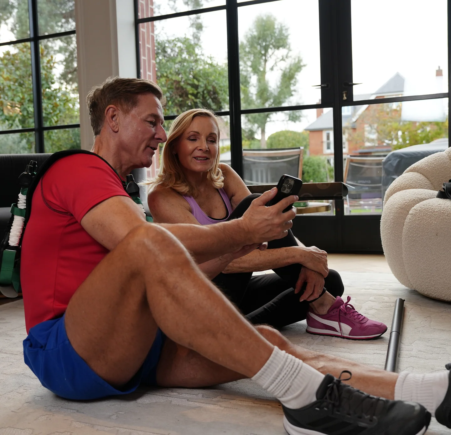
The reason
Not interface. The outcome the app protects.
Transformation photos on the store are the promise. Premium is the follow through.
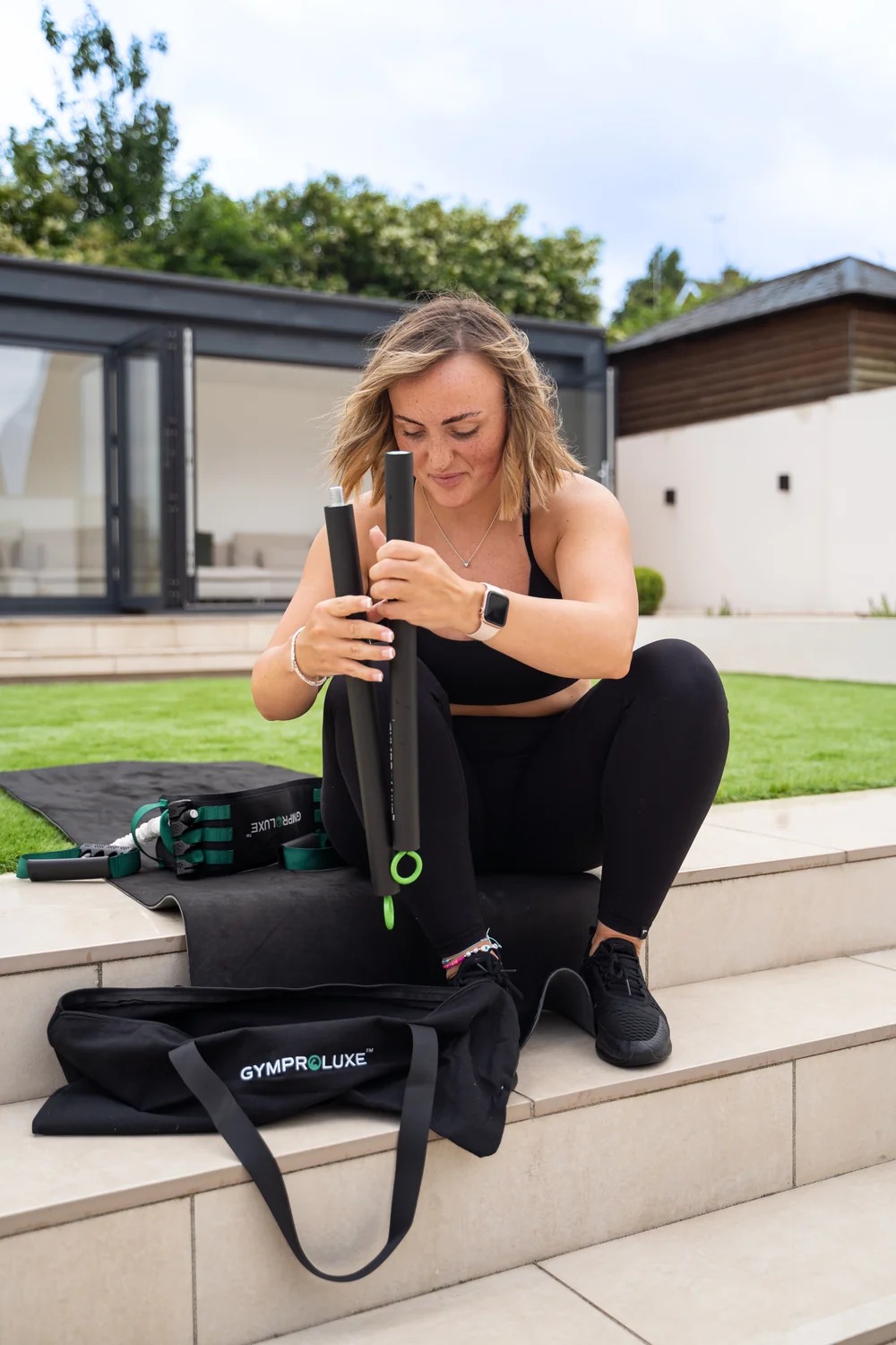
What is GymProLuxe
Portable resistance kit for home or travel. Store shown for context so you see the full journey. Our scope is the Premium app.
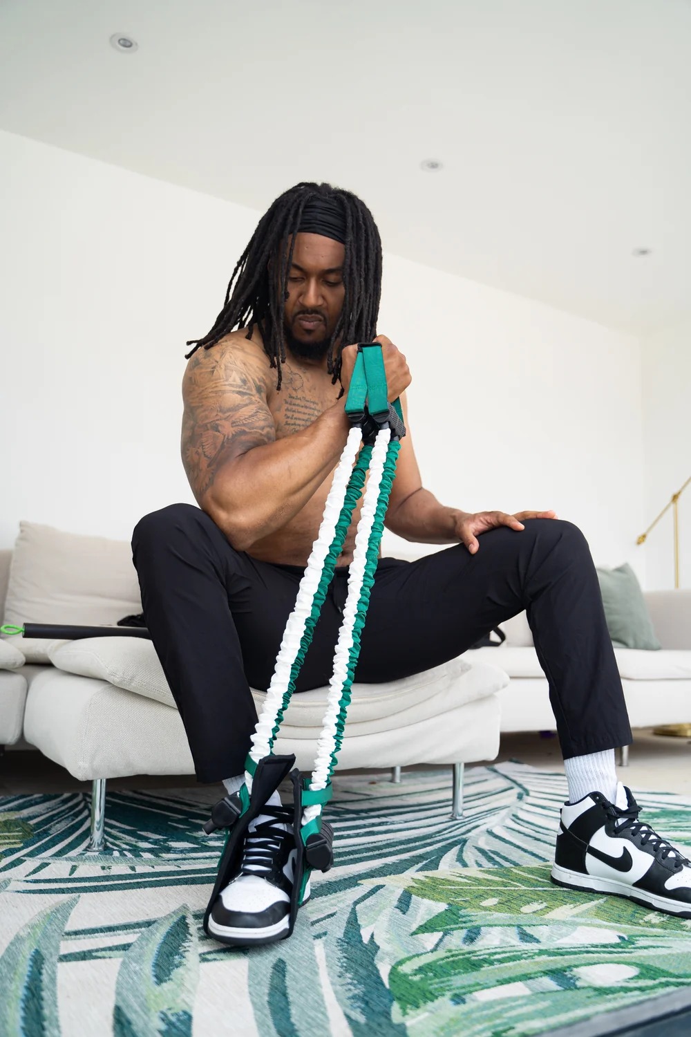
Portable kit
Bands, bar and training setup that travels.
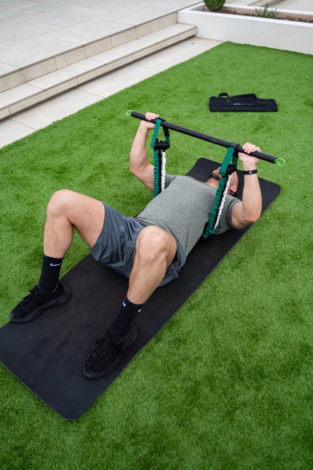
Up to 90kg resistance
Progressive load for beginners to trained lifters.
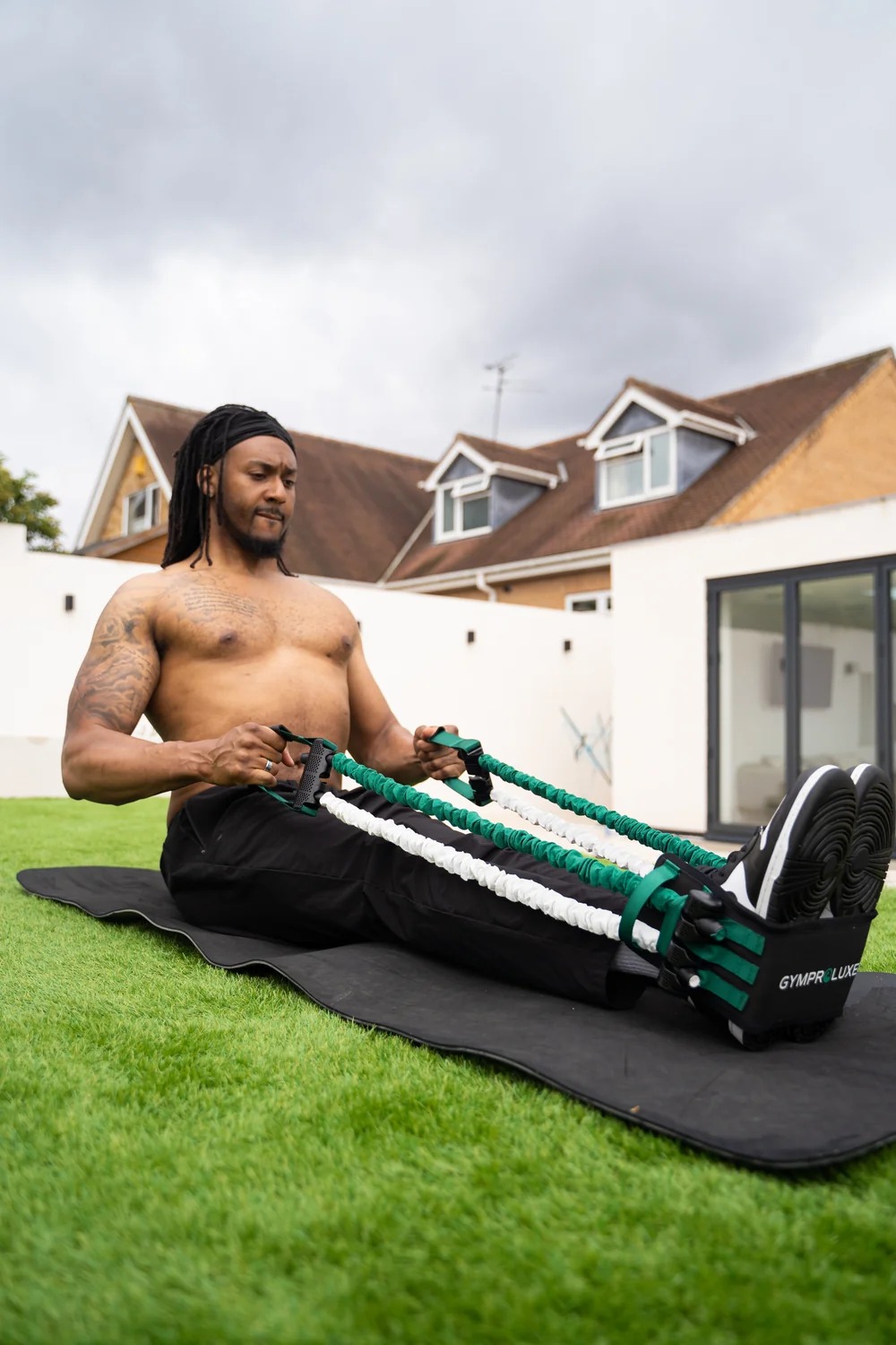
Home or travel training
Full body sessions in about 20 minutes.
Built for trust
Lifetime warranty, coach support and community.
Inside Premium: designed to keep you training
Drag or swipe the flow. It also loops on its own. Store by their team, app UX by ConvFetti.
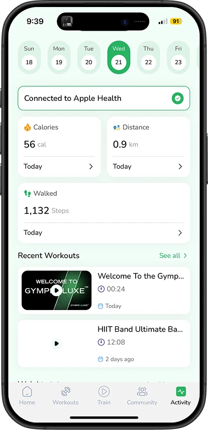
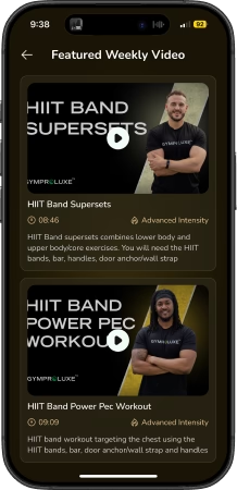
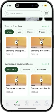
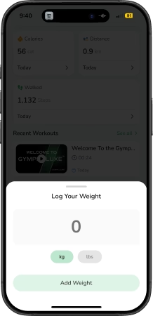
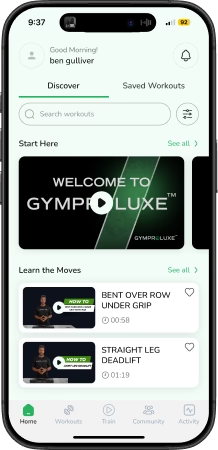
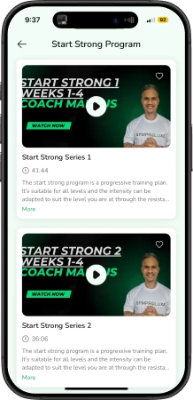
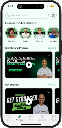
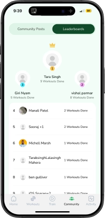
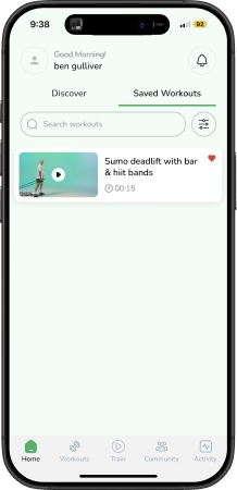
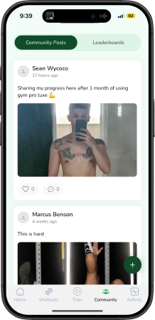
GymProLuxe built hardware people trust. Bands, bar, up to 90kg, 150k people training from home. But the digital experience did not protect what happens after delivery, when motivation fades and the kit sits unused.
Scope note: store by their team, shown here for context. Premium app UX by ConvFetti.
Our focus was:
- Map why training stops, in the buyers own words
- Define what the Premium app must support on day one
- Design a start so simple it survives week three
- Match every workout to the kit the buyer owns
- Make progress visible in seconds, not menus
The old pattern
Before touching screens, we mapped the failure loop. Tired after work. Scared to start. Anxious about form. Three stages, same ending. Skip today, keep scrolling.
Two personas anchored it. Sarah, 28, London, short on time and guidance. Jhon, 34, Manchester, inconsistent and hard to track progress.
The kit was never the problem. The gap between unboxing and routine was.
How the app decisions were made
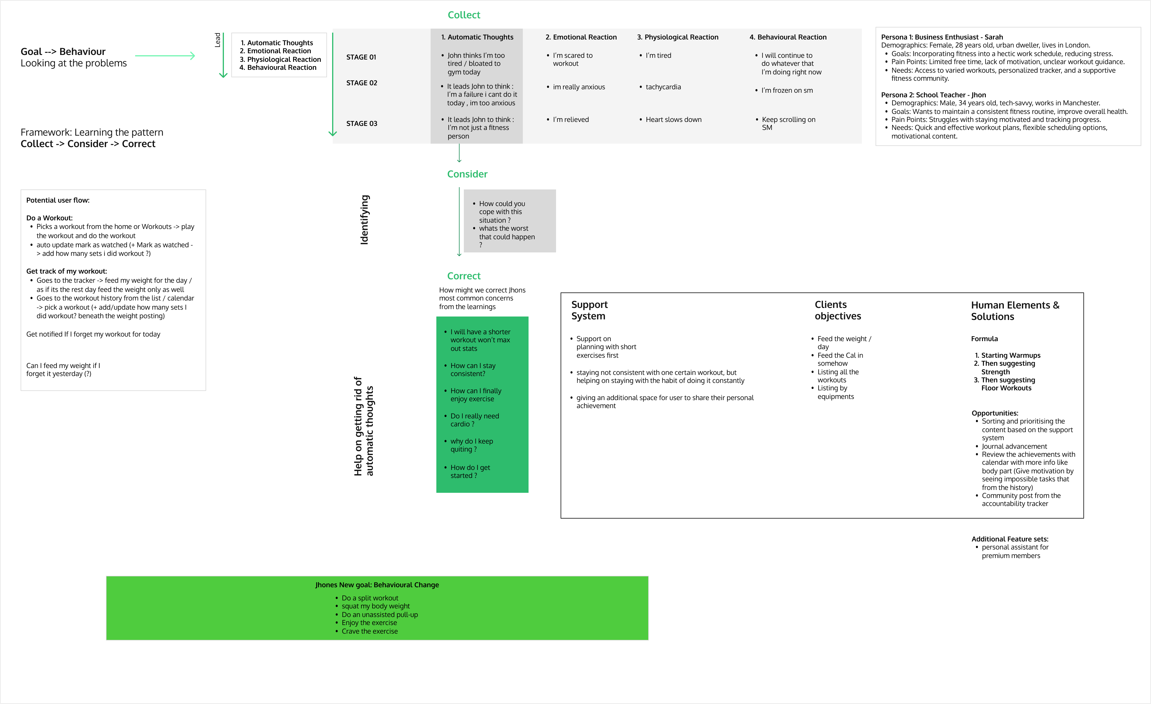
We kept it simple. Collect, Consider, Correct. The full working board sits below, tap to zoom.
Collect. Why training stops, mapped as thoughts, emotions and behavior across three stages.
Consider. What the app must do. Train at home, mark sets done. Log weight daily, review history on a calendar. Remind when a day is missed.
Correct. One screen, one fix. Short planned sessions first so starting feels light. Weight and calorie logging for visible momentum. Workouts filtered by owned equipment. Order is warmup, then strength, then floor. Streaks, calendar review and community support repeat use.
Signature: the Today Plan
The proudest decision in this project is the Today Plan. One screen answers what do I do today in seconds. No catalogue browsing, no decision fatigue.
What the buyer sees: a single plan matched to their kit and level. What sits behind it: equipment filtered programming, warmup to strength to floor ordering, and streak logic designed to pull them back tomorrow.
Store plus app
The website sells the kit. The app keeps the buyer training.
Shown together, the buyer sees kit and outcome in one story. Kit alone is less useful. Premium fits here in a simple way. More plans, more support, more reason to keep going.
Key outcomes
- A named system, not a pile of screens. Collect, Consider, Correct connects every design choice to a behavior.
- Starting got lighter. Short planned sessions first, matched to owned kit, with form cues at the point of doubt.
- Progress got visible. Weight logs, calendar history, streaks and community accountability in one loop.
- Premium earned its role. Kit plus actionable guidance is easier to trust than kit alone, which supports repeat value beyond hardware.
No conversion lifts are claimed here. We designed the app UX. The store metrics on this page are observed context from the live business, not our results.
From our side: the kit gets bought once, the routine is what transforms a life. Our job was to design the routine.
Summary
GymProLuxe had trusted hardware and a store that sold it well. What it lacked was a follow through for after delivery. We designed Premium app UX around one job: turn ownership into routine through a clear daily plan, kit matched programming and visible progress.
The result is a single story across touchpoints. Store sells the kit. App keeps the buyer training. Premium becomes the reason to return, which is where value beyond hardware lives.
Outcome
Equipment plus guidance is easier to trust than equipment alone. Premium gives the store story a follow through and a reason to return.
FAQ
FAQ
Did you rebuild the store?
No. Their team runs gymproluxestore.com. The store clips and product shots on this page are context so you see the full journey.
Why show the store at all?
Context helps owners see fit. You see where buyers start on the store and where the Premium app takes over after delivery.
What exactly did ConvFetti ship?
Premium mobile app UX, flow, screens and design system support.
Next project
Keep exploring our work
Up next
Perfyra
High-performance storefront for premium fragrance storytelling